




























Compare the label. Define the specification.
Explore real label examples, compare the construction and prepare a brief that makes the next decision clearer.
See the options before choosing a stock.
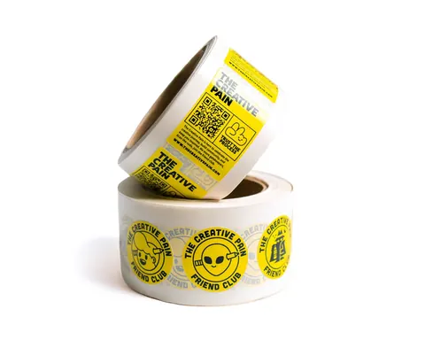
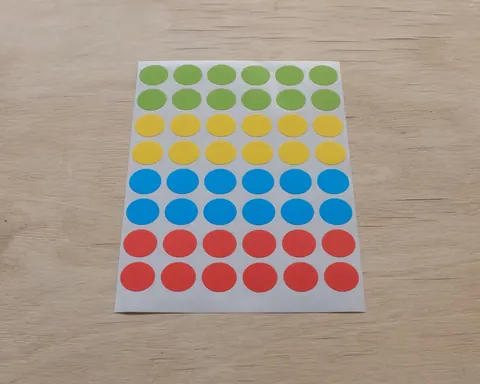
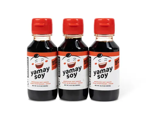
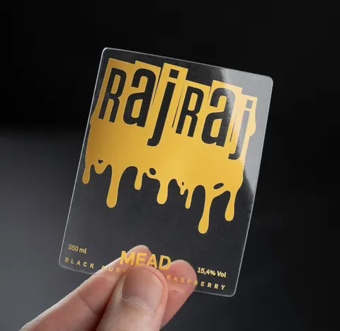
The catalogue brings together 60 label and transfer options, with photographs, material notes and questions to settle before ordering. Compare the visible grain, reflection, opacity and cut shape, then use the product details to identify the construction you want to discuss.
Compare more than the surface effect.
A paper texture, metallic background or clear appearance is only part of the choice. Face stock, adhesive, liner, print and finish work together on the pack. A white-background film and a clear film use the container differently; a delicate paper can need sheets rather than rolls. Record the exact variant so quotations and samples can be compared on the same basis.
Give each effect a clear place in the artwork.
Keep the print, cutline and any white, foil or relief masks separate. Share colour references and identify small codes or text that must stay readable. For transfer graphics, review the placement and carrier-removal method as well as the design. These details make the proof discussion more useful than a screen image alone.
Choose the reference that answers the question.
A PDF helps review layout; a stock sample shows colour and feel; a printed or application sample can test the chosen construction on your packaging. Agree which reference, checks and acceptance criteria the order needs. Bring the approved artwork version, material, quantities, application details and destination into one specification before production.