














White Ink on Clear Labels: What Buyers Should Approve
Specify transparent areas, visible white artwork and white backing clearly, then review the right proof on the actual package.

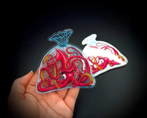
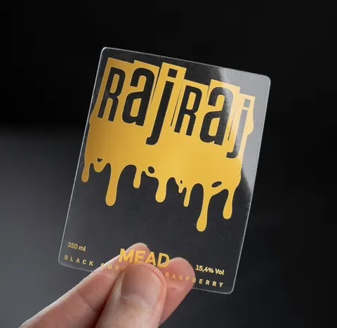
White ink on a clear label can serve two jobs: create visible white artwork and provide a base beneath selected colours. Decide which areas should stay transparent before approving the file. Otherwise a design that looks correct on a white screen background may communicate the wrong printing instructions.
The useful question is not simply “Does this label need white?” It is “Where should the package show through, and where should the artwork cover it?” This guide helps a buyer, designer and printer answer that question with the same marked-up proof.
Define three areas in the design
Avery’s white-underprint guidance explains that colour printed without a white base can appear translucent, while a white layer beneath the artwork provides an opaque base. Its artwork workflow also distinguishes printed white from areas where the material remains visible. The exact result depends on the print process, material and package, so discuss the intended effect rather than promising a particular opacity from a screen image.
| Design area | Intended result | Approval question |
|---|---|---|
| Transparent window | The package or contents remain visible | Is this area explicitly marked to remain unprinted? |
| White text or symbol | A visible white design element | Is it included in the printer’s white-ink separation? |
| Colour with a white base | A backed colour element on the clear material | Does the white layer cover the intended coloured area? |
Annotate these areas on a separate reference copy. Keep that copy distinct from the production artwork. A simple numbered diagram gives reviewers a way to report a specific error without editing the print file themselves.
Review the label on the real package
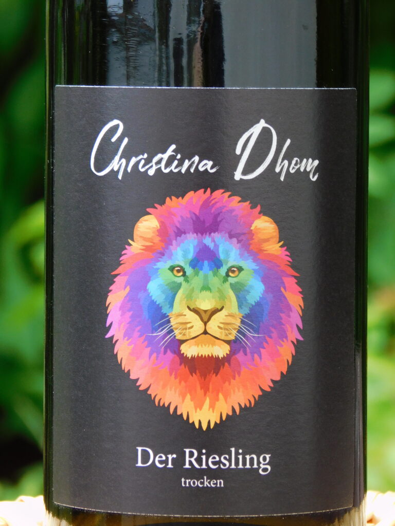
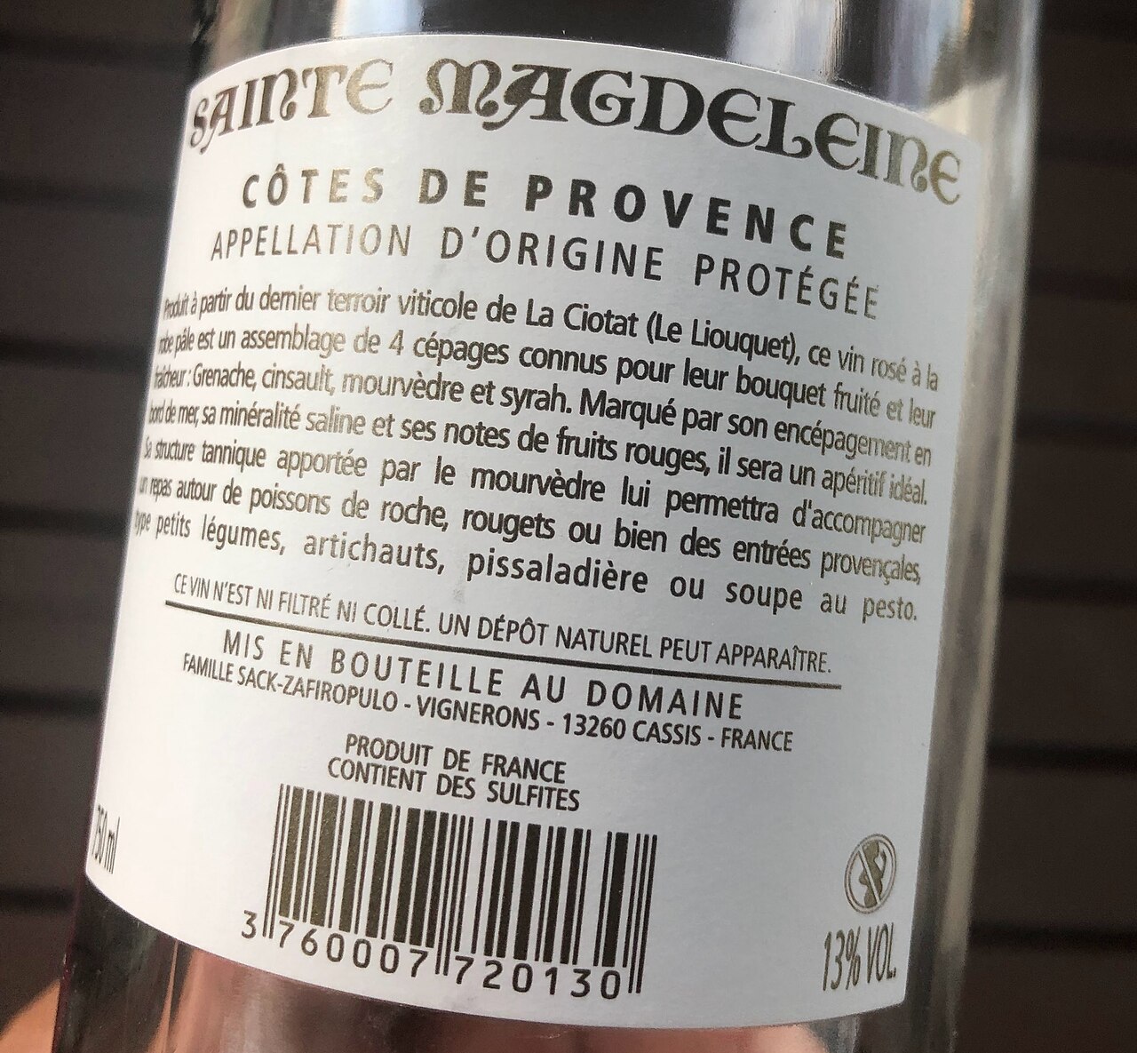
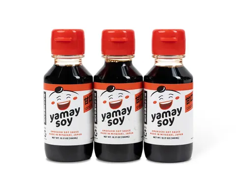
For a bottle label, include the actual container and representative contents in the approval brief. A front-facing mockup is useful for discussing placement, but evaluate the physical label in its intended position before deciding that a small line of text is readable.
List the package variants that will share the artwork. If the same design goes on clear, coloured and opaque containers, include each relevant variant in the review. Ask the brand team to identify which elements must remain visually consistent and which can intentionally reveal the background.
Use realistic viewing conditions for the decision: how a buyer reads the product name, how staff inspect a batch code, and how the package appears beside the other SKUs. Record the viewing context with the proof comments so the printer knows what the approval is trying to achieve.
Prepare a clear handoff to the printer
- Confirm the available process. Ask whether the selected construction and printing route support the intended white treatment. An available white-ink option is a capability to specify, not a guarantee that every material uses the same workflow.
- Ask who prepares the separation. Decide whether your designer supplies the white layer or the printer creates it for review. Assign one person to approve that interpretation.
- Use the printer’s exact file instructions. Confirm file format, spot-colour naming and any required layer structure. Avoid borrowing another printer’s naming convention without checking.
- Keep the cutline separate. Identify trim, clear areas and printable elements unambiguously. Use the agreed template and the printer’s production tolerances.
- Provide two review views. Request the finished artwork view and a view that makes the white areas easy to inspect. Label them clearly so a reviewer does not mistake the technical view for the finished colour.
Avery’s published artwork guidelines illustrate why supplier-specific instructions matter: its workflow identifies white ink using a named spot colour and shows the white area separately in a proof. Your converter may require a different setup. Our artwork guidelines cover the wider file handoff; agree project-specific details before exporting.
Approve the white layer as deliberately as the colour
During proof review, ask the designer and buyer to check the same four things: intentional clear windows, visible white elements, backing beneath coloured artwork and the relationship to the cut edge. Record comments against a single version number. A colour correction and a white-layer correction should both trigger a new approval record.
If white and colour meet at a small detail, ask the printer how it will handle that boundary and what the proof represents. Avoid specifying a universal adjustment value from an online tutorial. Have the printer identify any details that its process cannot reproduce reliably at the proposed size.
An electronic proof is useful for content and placement. Avery’s artwork guidance notes that screen colour is not an exact match to printed output. Where appearance is critical, agree a physical proof or representative production sample that includes the selected material, white treatment and finish.
Make the sample review reproducible
Create a short approval sheet listing the artwork revision, material reference, container variant, print process and finish. Photograph samples consistently and retain the accepted physical example. Write specific observations such as “small white ingredients text readable on the filled amber bottle” instead of “looks good.”
Appearance approval and adhesive approval are separate decisions. A visually successful print still needs application testing, and a label that adheres successfully may still need artwork changes. Test real samples under the intended handling and exposure conditions; results vary with the complete construction and package.
Questions buyers ask
Does a white area in a PDF automatically mean white ink?
Do not assume it does. Tell the printer which white areas are visible artwork and which represent transparency, then approve its interpretation. File handling depends on the agreed workflow.
Should the whole label have a white base?
Only if that matches the design intent. Mark the areas that must remain transparent and ask for a proof showing both the white layer and finished appearance.
What should I send to quote clear labels?
Provide the artwork, label size, package samples or photographs, intended clear areas and required quantities. Explore clear labels or clear stickers, then request samples for the proposed construction.